User:Dojo
How to make a great AoPS Blog CSS
This is part one of AoPS blog CSS customization. It is about setting up the blog so it can be edited. First, the browser that is most suited to (and basically required for my methods) web development like this is Opera. You should download Opera (if you can) and use it for your web development.
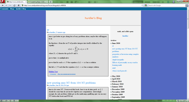
Now, open up a blog that seems to have little to no custom CSS. In this example, I will use Hurdler's blog.

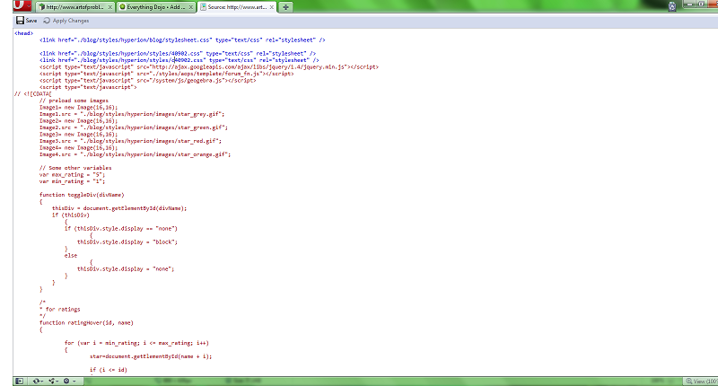
Right click, view source. Now you should see:

Remove the line that says:
<link href="./blog/styles/hyperion/styles/c40902.css" type="text/css" rel="stylesheet" />
If you are using a blog other than Hurdler's you should see a different number than 40902.
Next, in the line you deleted, type in the code:
 <style>
</style>
And press apply changes. Your code should look like:
<head>
   <link href="./blog/styles/hyperion/blog/stylesheet.css" type="text/css" rel="stylesheet" />

   <link href="./blog/styles/hyperion/styles/40902.css" type="text/css" rel="stylesheet" /> <-- May or may not be there.
<style>
</style>
   <script type="text/javascript" src="http://ajax.googleapis.com/ajax/libs/jquery/1.4/jquery.min.js"></script>
   <script type="text/javascript" src="./styles/aops/template/forum_fn.js"></script>
   <script type="text/javascript" src="/system/js/geogebra.js"></script>
   <script type="text/javascript">
...
With possibly different numbers.
This next part is optional. If you want to put your name/copyright on the CSS, insert the following in the style tags:
 /*
THEME NAME - Please do not plagiarize
YEAR Copyright YOUR NAME
Designed for AoPS blogs
*/
This is part 2: Designing Phase. This part is all about picking a color scheme or design that you want to create. I've seen many blogs that people make, and they are really nice blogs. There are all the flashy glowing effects (to be talked about later), complicated backgrounds, etc. etc. However, in order to make blogs more "professional", I like to emulate professional websites/blogs. Some websites I've imitated are http://twitter.com/, http://theappleblog.com/. These blogs, even if not 100% copied, end up to look more "professional" than a flashy website.
As a designer, it's your choice. In fact, if you have an idea that looks way better than these so called "professional" websites, that go ahead with that idea. However, for the rest of us, you can do your best to copy these websites. In this tutorial, I have chosen the twitter blog to attempt to copy. It is at http://blog.twitter.com/. I chose this blog because of how similar it is to AoPS blogs. We have similar heading, navigation bar, and layout. This makes the blog easier to copy. From this part on, I will be giving some specifics of this theme I chose, as well as some general CSS ideas.
This is part 3 of CSS basics. If you already know how to apply CSS, you can skip over this part. If not, you should read this, and do some research on your own, even if you know a bit of CSS.
CSS stands for Cascading Style Sheets. Cascading refers to the levels of importance in the Cascading Style Sheets. Generally, you won't have to worry about the levels, because the custom CSS, the one you will be designing, is applied last, making it the most important.
Let's take a situation, where you want to change the color of the entry. There are two ways you can find which element to edit. First, you can look at the source and find which element you are encompassing. The faster way that I have recently discovered on Opera is to right click the element, and press inspect element. The purple box should highlight the element you are trying to edit. You can also see what CSS is acting on the element. For example, the HTML code (on the left side of the inspect element) for the whole entry is:
<div class="entrywrap">
To edit this element, we use the following code:
div.entrywrap{
    property: value;
}
Now, this may seem complicated, but I'll break the code down. First, we see that the HTML element is classified as a div. Next, the class is entrywrap. In order to effect all divs that has the class of entrywrap, we put a period between them. If we only put div, there would be a pretty big problem, as there are many other classes and id's that are part of the div element.
Now, what happens if you find an element such as:
<div id="header">
? Simple, we just use a # instead of a . in our code.
div#header{
    property: value;
}
Next, we see property: value;. All this means is that a certain property, such as color or font is assigned to a value. Some common properties are background-color, color (which is font color), margin, margin-top, margin-left, margin-bottom, margin-right, padding, float, position, etc. etc. I'm not going to explain every single property, that's what google is for. :D There are plenty of tutorials on how to use CSS, so we don't need to go in depth here.
A short note on colors: you have to use hexadecimal coloring. This means you will have #_ _ _ _ _ _. For more info, check here: ... nation.htm.


