Difference between revisions of "User:Dojo"
| Line 1: | Line 1: | ||
<div id="notice" style="background-color: #f2adad; padding: 2px; border: 3px #b15959 solid; margin-bottom: 30px;">Under construction. Expect more stuff to happen.</div> | <div id="notice" style="background-color: #f2adad; padding: 2px; border: 3px #b15959 solid; margin-bottom: 30px;">Under construction. Expect more stuff to happen.</div> | ||
| − | <div id="header" style="width: 100%; text-align: center; font-size: | + | <div id="header" style="width: 100%; text-align: center; font-size: 60px;">How to make a great AoPS Blog CSS</div> |
<div style="font-size: 20px; text-align: center; width: 100%; margin-top: 40px;">Written By Dojo</div> | <div style="font-size: 20px; text-align: center; width: 100%; margin-top: 40px;">Written By Dojo</div> | ||
<br /> | <br /> | ||
| Line 52: | Line 52: | ||
*/ | */ | ||
</nowiki></pre> | </nowiki></pre> | ||
| + | </div> | ||
| + | <br /> | ||
| + | <div id="part_header" style="width: 100%; text-align: center; font-size: 30px;">Part 2: Designing Phase</div> | ||
| + | <br /> | ||
| + | <div id="info"> | ||
| + | This is part 2: Designing Phase. This part is all about picking a color scheme or design that you want to create. I've seen many blogs that people make, and they are really nice blogs. There are all the flashy glowing effects (to be talked about later), complicated backgrounds, etc. etc. However, in order to make blogs more "professional", I like to emulate professional websites/blogs. Some websites I've imitated are http://twitter.com/, http://theappleblog.com/. These blogs, even if not 100% copied, end up to look more "professional" than a flashy website. <br/> <br/> | ||
| + | |||
| + | As a designer, it's your choice. In fact, if you have an idea that looks way better than these so called "professional" websites, that go ahead with that idea. However, for the rest of us, you can do your best to copy these websites. In this tutorial, I have chosen the twitter blog to attempt to copy. It is at http://blog.twitter.com/. I chose this blog because of how similar it is to AoPS blogs. We have similar heading, navigation bar, and layout. This makes the blog easier to copy. From this part on, I will be giving some specifics of this theme I chose, as well as some general CSS ideas. | ||
</div> | </div> | ||
Revision as of 18:06, 7 September 2010
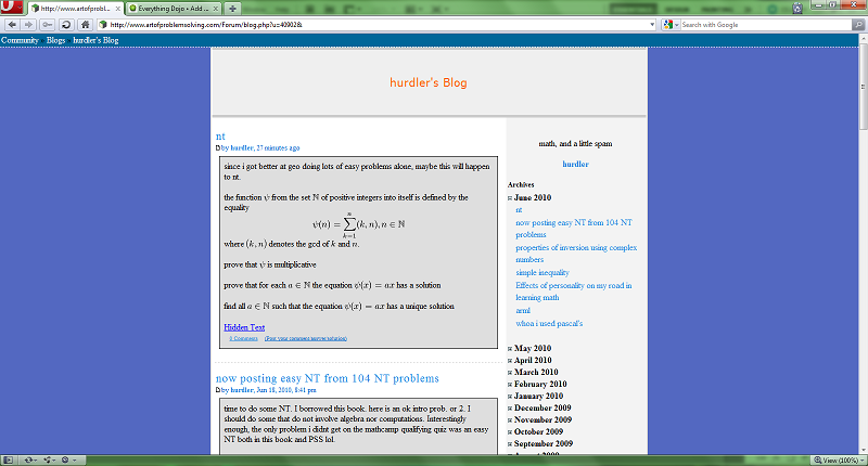
This is part one of AoPS blog CSS customization. It is about setting up the blog so it can be edited. First, the browser that is most suited to (and basically required for my methods) web development like this is Opera. You should download Opera (if you can) and use it for your web development.
Now, open up a blog that seems to have little to no custom CSS. In this example, I will use Hurdler's blog.

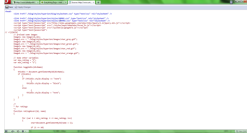
Right click, view source. Now you should see:

Remove the line that says:
<link href="./blog/styles/hyperion/styles/c40902.css" type="text/css" rel="stylesheet" />
If you are using a blog other than Hurdler's you should see a different number than 40902.
Next, in the line you deleted, type in the code:
 <style>
</style>
And press apply changes. Your code should look like:
<head>
   <link href="./blog/styles/hyperion/blog/stylesheet.css" type="text/css" rel="stylesheet" />

   <link href="./blog/styles/hyperion/styles/40902.css" type="text/css" rel="stylesheet" /> <-- May or may not be there.
<style>
</style>
   <script type="text/javascript" src="http://ajax.googleapis.com/ajax/libs/jquery/1.4/jquery.min.js"></script>
   <script type="text/javascript" src="./styles/aops/template/forum_fn.js"></script>
   <script type="text/javascript" src="/system/js/geogebra.js"></script>
   <script type="text/javascript">
...
With possibly different numbers.
This next part is optional. If you want to put your name/copyright on the CSS, insert the following in the style tags:
 /*
THEME NAME - Please do not plagiarize
YEAR Copyright YOUR NAME
Designed for AoPS blogs
*/
This is part 2: Designing Phase. This part is all about picking a color scheme or design that you want to create. I've seen many blogs that people make, and they are really nice blogs. There are all the flashy glowing effects (to be talked about later), complicated backgrounds, etc. etc. However, in order to make blogs more "professional", I like to emulate professional websites/blogs. Some websites I've imitated are http://twitter.com/, http://theappleblog.com/. These blogs, even if not 100% copied, end up to look more "professional" than a flashy website.
As a designer, it's your choice. In fact, if you have an idea that looks way better than these so called "professional" websites, that go ahead with that idea. However, for the rest of us, you can do your best to copy these websites. In this tutorial, I have chosen the twitter blog to attempt to copy. It is at http://blog.twitter.com/. I chose this blog because of how similar it is to AoPS blogs. We have similar heading, navigation bar, and layout. This makes the blog easier to copy. From this part on, I will be giving some specifics of this theme I chose, as well as some general CSS ideas.


